Typography is an essential element of layout design, one that can stand alone – without images or graphics or icons – if suited for the design purpose and executed well. Because I am intrigued by the meaning of words, I often consult an online dictionary in my day-to-day life. Merriam-Webster defines typography as “the style, arrangement, or appearance of a typeset matter.” The Latin word typographia comes from the Greek typos, meaning “impression, cast.” One of the early markers on the historical timeline of type is letterpress printing, and although I have never learned this art, (though one day I would like to do so), I am fascinated by the intricacies of type. How is it that 26 letters of an alphabet can vary so much in their appearance? Letter shapes, widths, end points and more offer a myriad of ways to visually represent words. Not only do I find satisfaction putting words together to communicate with purpose, but I also enjoy choosing typefaces that suit the project’s goal, audience and selected medium.
Formatting Type
Once a typeface is selected based on key factors, it takes great care and knowledge to format the type correctly. How long should the lines be? Should there be more or less spacing between letters (kerning), between words (tracking) or between lines (leading)? Should there be an indent or dropped initial? Is the alignment suitable for the content? How large should the text be? A good designer working with type will have an eye on all of these details.
Legibility vs. Readability
Readability is the goal when making decisions related to the treatment of type. Legibility refers to a typeface’s inherent characteristics, determined by the designer, including x-height (height baseline to the top of a lowercase “x”), stroke contrast, serif (tails), weight and more. Readability, by contrast, is how the type is set – the treatment, as described in the previous paragraph. It adds context – similar to buying a smartphone and customizing the apps and settings to meet a person’s particular needs.
Design vs. Aesthetic
Type is a good example of the balance of design and aesthetic that visual designers seek. Everything has a design – a function. Does it do its job? In this case, it should communicate a clear message. Aesthetic refers to how something looks. Is it appealing? Does it convey that message in the intended way? Design is really about people – to meet a need (function) and elicit a response (appeal).
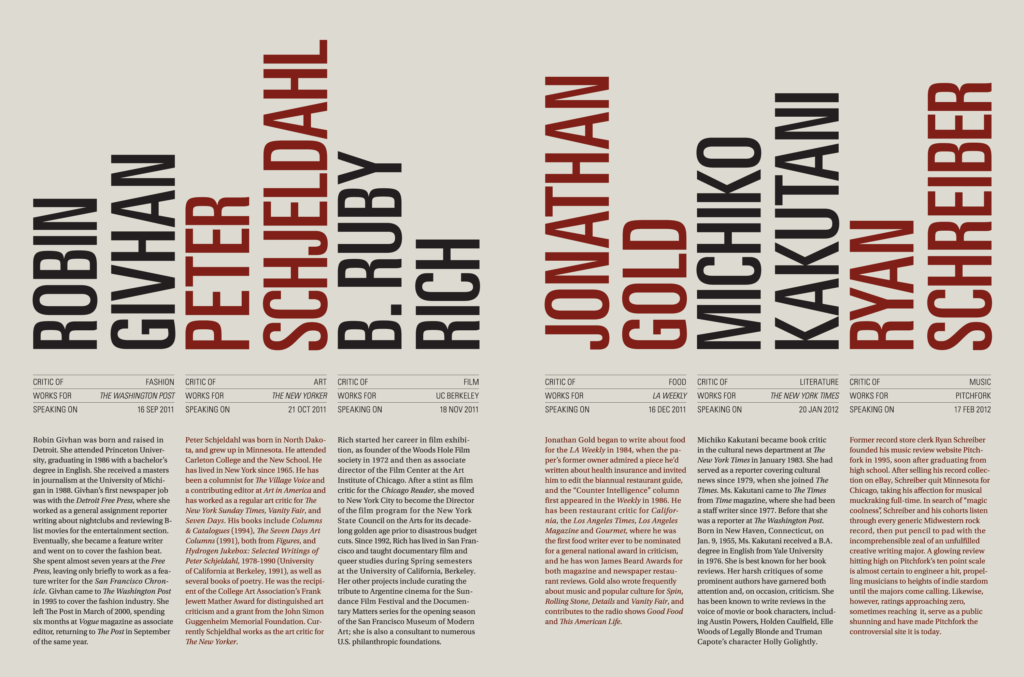
Below is an example of a layout that is very effective at creating this balance. The image is a portion of a brochure by Derek Chan, included on page 132 of Type Rules! by Ilene Strizver and viewable online here.
Client Work
Before words and languages existed, people communicated in the written from with symbols and pictures. Typography is part of this evolution and really is an art worth understanding and celebrating. As a designer, clients can trust that I will consider their project needs in order to fine-tune text so that it is professional, intentional and readable.