When I was in college, I remember my sister taking a communications class that required a textbook titled White Space is Not Your Enemy by Kim Golombisky and Rebecca Hagen. It turns out that she kept it, so I borrowed it recently to read it for myself. It’s an introduction into the world of graphic and web design, so reading through it was a review of the many principles I’ve learned and practiced throughout my professional career thus far. I find it interesting that I remembered the title and that it struck me as so impactful.
White space (or negative space) is an element that serves just as much importance as imagery and text. A good layout designer will use it to give balance and breathability to a design. Why is it that we tend to think blank space is unuseful? Perhaps it is similar to the tendency to fill in pauses in conversation when no one is speaking. Pauses in conversation can have impact – in plays and in speeches, for instance – similarly, negative space in design is purposeful.
Negative space helps designers draw attention to elements of a design they want to emphasize and ensure the intended message is clear. The last thing you want in a world that constantly sends messages from every direction is for yours to be muddled by a crowded ad or flyer when your audience’s eyes do find it.
Because it has visual weight just like positive space (photos, illustrations and copy), negative space requires attention in how it should be used. Trapped space occurs when it is isolated inside a layout – for instance, when two columns of text have more space than a suitable margin requires. Negative space works best when it opens to the margins.
Designers can find really creative ways to use negative space in logos as well to add interest. This “cut out” effect allows for limitless creation and demonstrates a skill in marrying the values of a business or organization with a recognizable symbol or image.
Logo examples from the web:
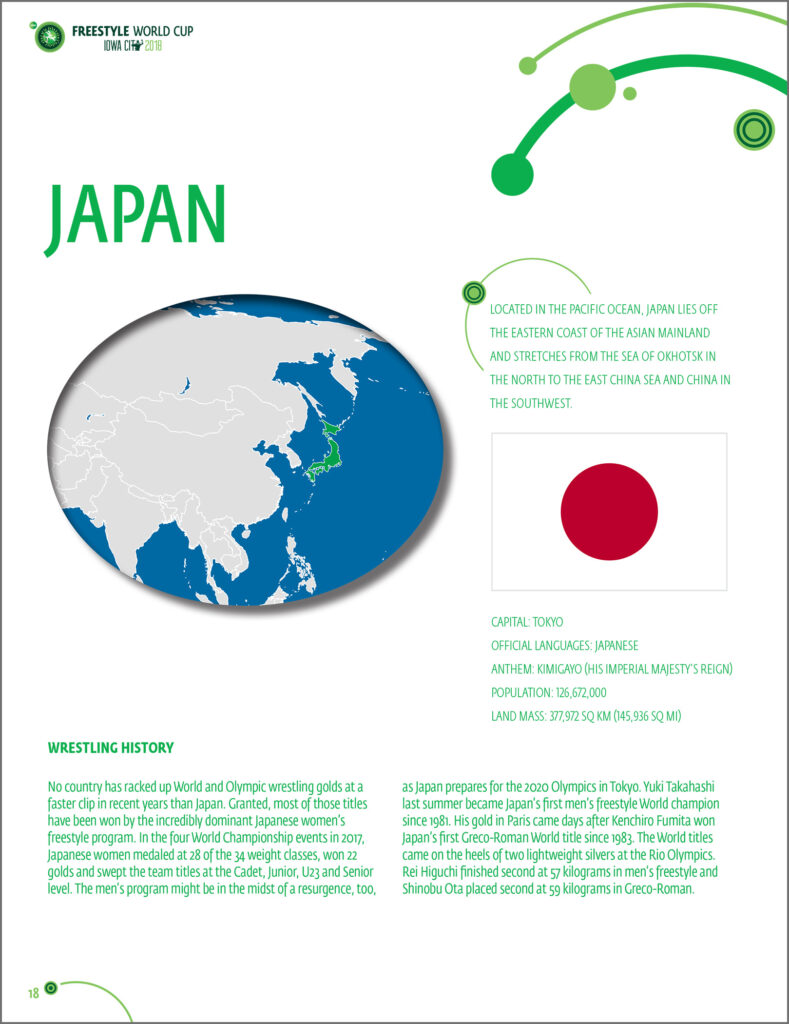
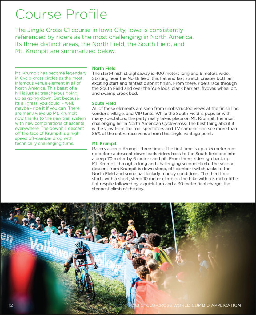
Layout examples from previous work:


Effective use of negative space is something I value in my design work. Some of the simplest designs with few, quality elements can be the most effective in delivering their message. This is the power and benefit of white space – which, I agree, is definitely not your enemy.


